Objective: to be able to evaluate
Outcomes:
Some: will be able to comment on choices and decisions made by relating to the codes and conventions throughout and by reflecting on changes that are going to be made on the second draft (Grade A)
Some: will be able to comment on choices and decisions made by relating to the codes and conventions throughout and by reflecting on changes that are going to be made on the second draft (Grade A)

When creating my individual digipak, I had to bear in mind that I wanted my final outcome to be simplistic yet effective as too much editing/over elaborate effects/colours would not be conventional or follow what audiences would expect from an Indie ancillary product. When conducting the photoshoot with the artist, I wanted her to achieve a typical Indie look, similar to that of fellow Indie artists such as Ellie Goulding/Lorde/Laura Marling. Therefore, her make-up is simple and not over complicated so she is wearing very little face make-up with a striking red lipstick to adopt a similar appearance to our chosen artist Nina Nesbitt. Moreover, I didn't want to use artificial lighting throughout the photoshoot (photos used within my ancillary products) because it would not be conventional whatsoever and it would also not flow with the supporting product: the music video itself in which naturalistic lighting is used (only sunlight with references to artificial lighting such as a lighter used to ignite the fire which burns through the symbolic playing cards)
In addition to the mise en scene playing a fundamental role throughout my photoshoot for my digipak, iconography is also highly important. Iconography used was simply the acoustic guitar which appears throughout the video, the artists weapon to mastering her talent. The use of a guitar acting as a motif captured throughout all products we have created is highly conventional, and therefore allows the audience to engage in not only the artists talent but the genre itself as it promotes both effectively.
In addition to the mise en scene playing a fundamental role throughout my photoshoot for my digipak, iconography is also highly important. Iconography used was simply the acoustic guitar which appears throughout the video, the artists weapon to mastering her talent. The use of a guitar acting as a motif captured throughout all products we have created is highly conventional, and therefore allows the audience to engage in not only the artists talent but the genre itself as it promotes both effectively.

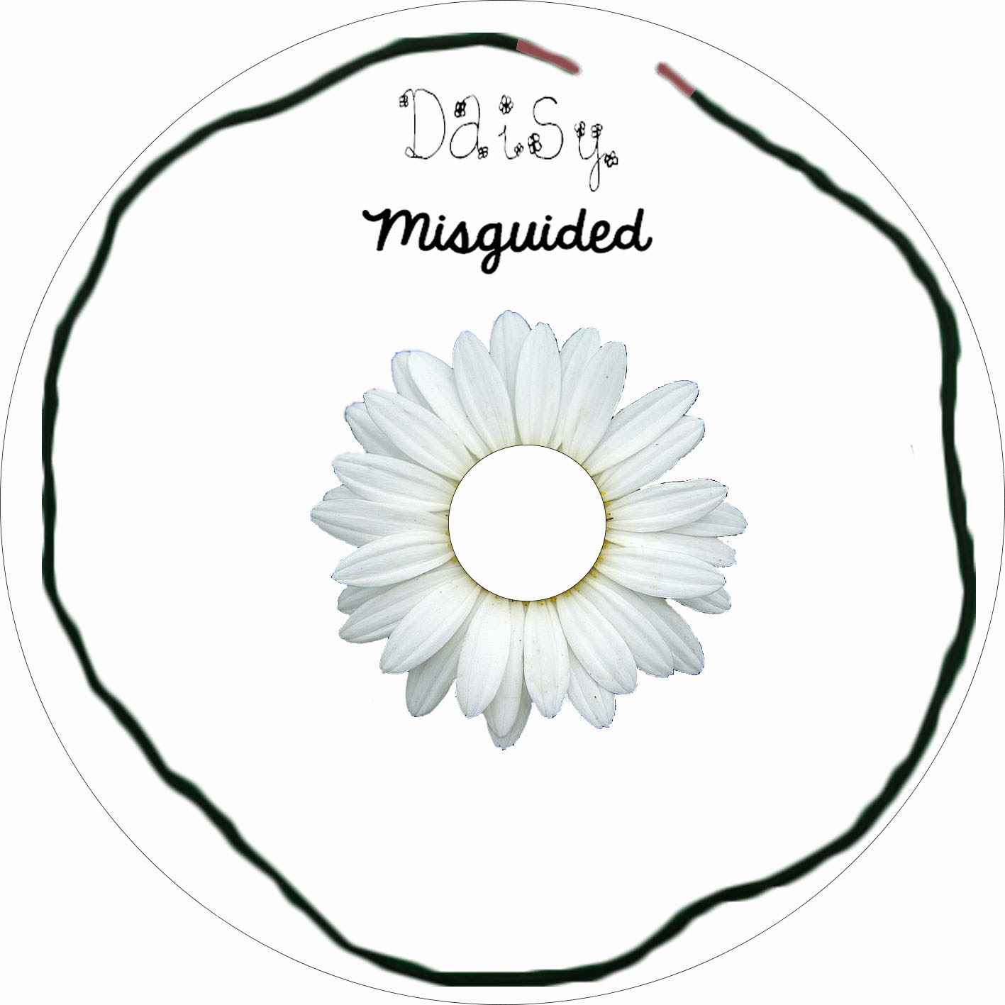
From the start of the planning process for my digipak, I knew that I wanted to include the use of a shoestring when creating it. Therefore, I photographed a literal shoelace which I positioned onto the green screen and cut around on Photoshop using the ___ tool. I used the shoelace in connection to the main hit single (our chosen song) entitled Noserings & Shoestrings which I hope that the audience can engage within and recognise the correlation between the imagery and the song. I also wanted to involve imagery of a Daisy as it has an obvious link with the artists name. In addition to the flower imagery linking to the artists name, flowers are also highly conventional to the Indie genre as they have connotations of nature and is an organic reference to growing; something the artist is doing as she is developing throughout her career. Although my choice of colour for the CD background is evidently white due to it's connotations of purity/fresh outlook, it did not affect the fact that the petals of the flower are white because they are of varying shades, therefore making the petals more noticeable which will result in consumer satisfaction.
CD: imagery of a literal shoestring to relate to the main hit single (our chosen song) 'noserings & shoestrings'- audience connection. Imagery of a Daisy to correlate to the artists name... also artist name and album name repeated to encourage the audience to recognise the main information... flow evenly throughout (all slides work together to fulfil conventions and persuade audience to buy into the product)
most complex to create... most effective centre of CD= centre of the flower- do not see yellow

 The back cover of the digipak is my favourite slide of out of the 6. This is because I have used the photo in which the artist is artist looking to the right side of her which therefore allowed enough room to insert the song titles included within the album entitled 'Misguided'. I like this because it looks as if she is reflecting upon her songs and how they may be responded to by her target audience which could benefit her career in the music industry. Although this slide is simple I believe it is effective as it follows clear Indie conventions which traditionally appear within the genre for example the brick wall acting as the background which depicts an urban vibe but it has the acoustic guitar to contrast this. Within many of Nina (our chosen artist) Nesbitt's visual works including her magazine advert (and recent music video to 'Selfies' above),
 a brick wall is often involved to communicate the genre of Indie and therefore I have repeated this in aim to fulfil the desired genre characteristics. I also felt it was necessary to involve the artists record label within the back cover as it has a huge impact upon the artist as it is also associated with many other successful artists of which the audience may already know of, therefore determining her success as a new and upcoming artist within the developing Indie genre which is now recognised by a more mass audience when not so long ago it was only enjoyed by niche audiences. Also when creating my back cover I felt it was important to include a barcode to achieve a professional looking outcome as all CD's distributed within major stores involve a barcode to be scanned by consumers to purchase it.

Welcome notes are included within digipaks for musical artists to allow the audience to feel involved within their career and their process of the album and often includes a 'This is for you' message, hence why I have used the same. By stating the album is for 'you' (pronoun used to imply the artists fans), it makes the message more profound and personal and therefore a connection will be made between the artist and audience in turn increasing her popularity within the industry. When writing the artists welcome note I wanted to hint how she was once a small, unknown artist 'from writing lyrics in my bedroom to producing in studios and performing to hundreds of fans' which also communicates the Indie genre as it is generic that Indie artists start off fairly small and supported by Independent Record Labels. The font choice for the welcome note is important because it is no doubt one of the fonts that need to stand out the most. Therefore, I chose an italic style font which appears wholesome and organic. As the welcome note is written by the artist herself, I also wanted the font to appear as if she had handwritten it onto the CD leaflet, almost as if she had added her touch and signiture, again allowing the audience to feel more involved within her career and ultimately build the vital relationship needed between the consumer/record label and artist. This particular slide within the digipak also involved downloading a brush tool. I wanted to use a brush tool/stencil that involved a flower to act as a direct correlation to what the artist is photographed wearing therefore the final tool I selected was perfect as it was a cluster/bunch of roses. On Photoshop, the software I used to create the digipak was the option to alter the colour of the brush tool therefore I chose a dark shade of pink which eventually dimmed shades per layer I inserted. This is because the colour pink stereotypically engages the female audience in which we are targeting through both our music video and additional ancillary products. I also chose to layer the stencils of the roses into a merged pattern to symbolise the artists journey so far and flowers are also a symbol for hope and growth which is relevant to the artist too.

I purposely selected this particular image from the photo shoot to appear as one of the plain ones within my digipak because like the image below, the artist does not have eye-contact with the audience. Instead, she is displaying an interest towards a horse which arguably relates to the ongoing theme of nature embedded throughout the rest of the digipak images in which the artist is posing to the camera in the forest. By stroking the horse with one hand and holding her guitar in the other, it suggests the artists down-to-earth, considerate and caring personality whilst simultaneously not letting go of her ambitions and talents: therefore this is an effective and striking image to include.


In all 6 slides of the digipak I have created as an individual, the artist is viewed wearing a denim jacket and a floral dress. This outfit combination is highly conventional of the Indie genre as they are stereotypical of what young people who enjoy the genre would wear. Whilst the floral dress depicts nature and organic vibes the denim jacket links closely in with it and coincides with the dress as it is simplistic and has a 1970's Vintage/Bohemian feel. The artist is also wearing a bright red lipstick which is popular amongst our target audience of females aged 16-25. This therefore acts as something fans can relate to with the artist and provides them with an opportunity to become involved with her personal style. I chose this photo to use for one of the plain ones within the digipak because it shows the artist performing without eye-contact with the audience, therefore in her own element of enjoying her talents which is now her career.
Introduction-
· How did you use your research into digipak to start planning your own?
Evaluate-
Do you think your digipak are conventional to your genre? Consider the colours/connotation, images, layout etc
· Do you think your target audience will be able to build a relationship with your artist?
I made many purposeful artistic decisions with the intention to present the audience an opportunity to build a relationship with the artist throughout creating my individual digipak.
I made many purposeful artistic decisions with the intention to present the audience an opportunity to build a relationship with the artist throughout creating my individual digipak.
· What choices and decisions did you make and why?
· Are your choices and decisions conventional to your music genre and why?
· What could you change and why?
Reflection-
How will this draft assist you with creating your group?
Upon reflection, the above draft of my artist digipak, just one of the ancillary products needed to be presented to our target audience to successfully promote our artist will assist us as a group when creating a collective design on Photoshop.
Upon reflection, the above draft of my artist digipak, just one of the ancillary products needed to be presented to our target audience to successfully promote our artist will assist us as a group when creating a collective design on Photoshop.
This post demonstrates a good understanding of the choices and decisions that you made to your own digipak. You have considered the conventions of indie and your research inspirations well and have considered your reasons for selecting certain images, colours and backgrounds.
ReplyDeleteNow you need to focus more on photoshop and the tools that you selected to use and the effect it has