This magazine advert for Nina Nesbitt, a new and upcoming Indie artist is fundamentally created and distributed to create awareness of the artist as she is still in the process of creating a loyal fan base; at the moment it is fairly niche (but by her Indie-pop song Stay Out she has attracted and engaged a more mainstream audience in aim to increase her success in the industry)
A Live Nation, SJM, Future Sound, DHP and OF Concerns presentation in association with CODA

Some: will be able to use the analysis as inspirations and create a conventional magazine advert (Grade A)
I was unable to find a magazine advertisement for our chosen artist therefore decided to analyse the poster displayed above which promotes her first tour.
As evident above, there is equal emphasis on image and text which combine to create the advertisement. The text promotes two websites which sell and distribute tickets to the venues she is performing at: Live Nation and Ticket Master, used by millions of people in the UK. The venues chosen are reasonably small which correlates to the niche audience she has attracted through the sales of her EP's and singles. Nina's gigs are intimate due to the venue size not being overly vast and it holds a low-capacity of people paying to watch. For some, smaller venues are ideal because it makes them feel as if they can make a personal connection between themselves and the artist as it is more likely to be noticed in the crowd in comparison to Pop artist concerts which are held in large arenas which is approached with a large budget due to the extreme ticket prices sold to a mass market. Brighton The Haunt and London KOKO are examples of small venues within her tour and are both recognised to be quirky locations which therefore appeals to young people searching for reasonable ticket prices and looking to enjoy an intimate performance.

The main style of language is formal and the purpose it wishes to achieve by being involved within the poster is to inform audiences of the artist performing, venues followed by dates and how they can purchase tickets by providing wed addresses. Fundamentally, the simplistic design with the 50/50 divide between artist image and language harmonises with the simplistic approach as it lacks promotion of the artists music. Many tour posters would include song titles to inform and excite audiences as it would enable them to recall which songs they know the artist performs, therefore becoming subconsciously persuaded to attend the music event.
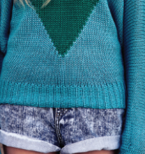
 Nina Nesbitt, our chosen artist is presented to the audience as a quirky individual which appeals to her teenage focused target audience. As well as promoting her tour dates and venues, this advertisement promotes self-expression due to the use of unique clothing. The artist is represented to be like any other female of her age group which makes her increasingly popular amongst her fans because it is easier to build a relationship with someone who is similar to you rather than someone who doesn't share the same interests, in this case; Indie music. Nina has long, blonde and messy hair. Therefore, she arguably adopts a scruffy and street appearance which is common amongst female Indie artists which are currently in the industry including Ellie Goulding and Laura Marling (before she changed her appearance and dyed her hair brown) Because the artists hair is un-styled it echoes that she is not high-maintainance which conforms to an Indie style. Despite this, make-up is used to cover up any blemishes and create a trademark image for the artist. Dark winged eyeliner and mascara is used in addition to red lipstick which is eye-catching and therefore memorable and iconic. This is effective despite the fact she is a small upcoming Indie artist which may draw attention to her more so than if she were to adopt a raw and organic image like many female Indie artists. Nina is also shown to be wearing a comfortable, over-sized jumper which is divided between blue and green. Audience members may view the artist to be laid-back because of this unlike Pop artists who could be dressed in an expensive and extravagant costume which disguises their identity and sells them as a commodity (Dyers Star theory) rather than an individual with a raw musical talent. Nina's outfit looks like it was bought from a high-street shop rather than promoting designer labels and is therefore affordable. This affordable appearance is traditionally seen within the Indie genre and therefore makes the artist increasingly appealing as her target audience consists of teenagers which may be unemployed. Therefore, all audience members could mimic her image with ease if they wanted to achieve a similar physical exterior.
 Facial expressions and body language play a huge role within this tour poster. Nina appears emotionless which doesn't reflect her music which depicts a variety of emotions such as loneliness, confusion and lust. Similarly, her body language communicates that she is static/stiff, almost like a statue. This pose doesn't allow her to express her personality much like her lyrics do. This may therefore alienate or make audiences disinterested in the promotional tool or may engage others to want to find out more about who the artist actually is. However, her appearance conforms to what audiences may expect from an Indie artist because they are not aiming to disguise themselves within falsities such as extravagant poses which are more eye-catching.

The design/layout of the magazine advertisement is fairly simplistic as there is one main image of the artist and her name/logo which uses 50% of the space whilst the remaining space is filled with necessary information regarding her tour. Tour dates are easily recognisable and eye-catching so if this advert was displayed on a bus/bus stop you would be able to quickly identify which date you would like to purchase tickets for and eventually attend. On the left-hand side of the frame the audience member notices the artist which is the central focus of the advert. In many magazine advertisements for Pop artists for example, the artists image would fill a large proportion of the frame because it would inform the audience they are currently touring which may entice them to conduct research on their dates rather than be informed straight away on the advert. Due to Nina being a small and upcoming artist which not many people know (evident in the research we conducted), it is crucial for her image to be recognised to gain the audiences interest which would then lead to ticket sales and performances.
 Typography used is effective within this advertisement of the artists tour. It is evident who the central focus of the advertisement is due to the large font logo of the artists name in addition to the support of the image. The colour white is used for the artists name to contrast the brick wall background and make it stand out therefore attracting a larger audience. Tour dates are also displayed in capital letters with a simple font to achieve an easily recognisable look which would appeal to many audiences because you can glance at it and quickly memorise the date and venue you would like to book rather than having to study the poster because it is too detailed with small font. Nina's logo is easily recognisable and appears to be a relaxed font; almost handwritten which relates back to the laid-back style she adopts within the image presented. It also looks very organic which follows conventions of the Indie genre which isn't overly manufactured and true to itself. We as a group decided we would like to use a similar logo style because it is conventional to our chosen genre. As our artists name is Daisy, we would like to echo this and make our logo appear organic and use a flower within it to further connote the natural appeal of the Indie genre. Therefore, we have been inspired by our chosen artist because she is a typical of the genre we are also employing which proves we have conducted research which could benefit our creative production.
How does the advert promote the music genre?
This tour poster of our chosen artist Nina Nesbitt promotes the music genre. This is through encouraging the audience to engage in a live performance of the music, even if it is at small venues. The ticket prices for many Indie gigs are not expensive which may also entice audiences to invest and therefore become a fan of the Indie genre. A vital element to many Indie music videos (Passenger for example) is footage of a live performance therefore this tour poster offers a conventional element within the genre for audiences to witness first hand rather than on an online platform. Therefore, this tour poster successfully promotes the Indie music genre as it offers a variety of audiences to engage within it.
How does the advert promote the artist?
The tour poster is created intentionally to fulfil the fundamental purpose of promoting Nina Nesbitt as a new and upcoming artist into the Indie genre and industry as a whole. In regard to the business element to the music industry, artists must produce a certain amount of profit not only via album/EP/single purchases but merchanise, magazine shoots/interviews and actual performances in order for them to stay current within the ever-growing industry. This poster promotes the venues in which the artist will be performing in within her tour and is designed to fulfil the purpose of persuading the audience to become familar with the artsit and therefore purchase tickets. The central focus of the poster is an image of Nina which therefore allows the audience to build a relationship with her (as present in Goodwin's theory) Her natural and relatable representation plays a significant part in promoting her as an artist whilst allowing the audience to gain an insight into the type of artist she is as it promotes the Indie genre too, the genre in which the artist writes and performs within. She is not restricted to the singular genre of Indie however as she breaks boundaries within it as she involves elements of Pop with her mainstream hit Stay Out which larger audiences may be aware of. The poster also encourages potential audiences to listen to the artists music, therefore supporting her which in turn benefits the artist as it generates a larger fan base and makes her successful within her genre.
The tour poster is created intentionally to fulfil the fundamental purpose of promoting Nina Nesbitt as a new and upcoming artist into the Indie genre and industry as a whole. In regard to the business element to the music industry, artists must produce a certain amount of profit not only via album/EP/single purchases but merchanise, magazine shoots/interviews and actual performances in order for them to stay current within the ever-growing industry. This poster promotes the venues in which the artist will be performing in within her tour and is designed to fulfil the purpose of persuading the audience to become familar with the artsit and therefore purchase tickets. The central focus of the poster is an image of Nina which therefore allows the audience to build a relationship with her (as present in Goodwin's theory) Her natural and relatable representation plays a significant part in promoting her as an artist whilst allowing the audience to gain an insight into the type of artist she is as it promotes the Indie genre too, the genre in which the artist writes and performs within. She is not restricted to the singular genre of Indie however as she breaks boundaries within it as she involves elements of Pop with her mainstream hit Stay Out which larger audiences may be aware of. The poster also encourages potential audiences to listen to the artists music, therefore supporting her which in turn benefits the artist as it generates a larger fan base and makes her successful within her genre.
How does the advert attract an audience?
This advert/tour poster attracts audiences in two main ways. Firstly, it gives the audience a short representation of the artist as a conventional Indie artist and therefore, the audience then become familiar with her style, representation and overall image. Secondly, it attracts an audience through promoting the venues of an intimate size which may appeal to many who dislike the large scale performances in bigger venues which does not allow the audience to feel involved within the music. All elements embedded within are conventional which allows the artist to be seen as appealing by her already developed audience of a niche size consisting of young adults, specifically females who may consider the artist to be someone to aspire to be/be motivated by their image/lyrics.

Florence and the Machine, although not our chosen artist is an artist of the same genre: Indie. Similarly to Nina Nesbitt, I was unable to find an appropriate magazine advert so instead chose to analyse a poster advertising a single show of hers.
Florence and the Machine are an English Indie-pop/ Indie-rock band, consisting of lead singer Florence Welch, Isabella "Machine" Summers, and a collaboration of other artists
After conducting secondary research regarding the venue which is promoted, I found that Esplanade Theatre is based in Singapore which can also be referred to through the use of dollars for the currency stated within the poster. Although Florence and the Machine is an Indie-pop/rock artist, the band appeals to far more of a vast audience than Nina who attracts a niche audience. It is almost unheard of for an artist of the Indie genre to perform in such a huge venue in such a diverse country and most audiences would not expect her to traditionally perform at this particular venue.
This poster advertises a UK artist breakthrough into a completely contrasting country where the music industry differs massively. The UK music industry evidently has a huge influence on other countries with many artists breaking big successful countries such as America.
 Language style plays a fundamental role towards the purpose of the poster: to advertise the artist and her performance. The use of "tickets on sale now" displayed in capital letters urges the audience to purchase and attend the music event as it is almost like an instruction which persuades the audience due to the word "now" which may make the audience member buy into the 'product' quicker as they may sell out fast. The use of "booking hotline" and "online booking" The phrase "with special guest The XX" also promotes another band of the Indie genre. This may entice fans of the supporting group to see them as well as a similar band and allow them to develop a wider pallet of musicians they enjoy. Although the bands are similar they are diverse as The XX have not claimed mainstream success like FATM have with their many hits in the mainstream charts including You Got The Love, Spectrum, Say My Name, Sweet Nothing and Shake It Up.
Artist representation is key within the above poster. The main/most recognised band member is the central focus of the image although the background is detailed. The image is strong despite the fact that she is shying away from the camera whilst holding a fussy pose in which presents her to be confident and outgoing. As she does not have eye-contact with the audience, it may make many feel disengaged with her overall image and therefore not purchase tickets. On the other hand, this lack of eye-contact may contrastingly draw others to want to build a relationship with the artist as she offers a sense of mystery which may appeal to audience members who are not a previous fan. Her make-up is exaggerated by the fact that her eyes are drawn closed but is applied mildly elaborate: far from natural but noticeable instead. This makes her appeal glamorous which doesn't conform to traditional images of Indie artists in the industry. Therefore, her image subverts the genre she is within because many female Indie artists (Nina Nesbitt for example) are presented to audiences to appear natural with minimalistic make-up and clothing which therefore puts the main focus onto the artists music rather than their image. Her hair is also loosely put up which could suggest she is independent and strong-minded. The colour of her currently fashionable hair is red which is very iconic and presents her to be firey, passionate and organic.
Colours used compliment the artists image and the way in which she is represented to the audience being persuaded to buy into the product: event tickets. A black frame holds a large ratio within the poster where white fonts are added to present a contrast. Black and white acting as a motif also creates a classical outcome and juxtaposes the remaining colours. Dark red is used for the lungs also to contrast the more natural and paler colours used to fill the flowers and birds. Pale pinks are used for many flowers in the background possibly to hint femininity or make a romantic statement whilst the vibrant yellow colours for the birds help create the symbol of the way the artist would like to be portrayed within her genre. Overall, all colours used are intentionally used to present contrasts and symbols and work effectively together as it sticks to a simple scheme whilst being eye-catching against the harsh black frame.
The final design and layout is also crucial towards achieving the purpose of selling the artist and product. Evidently, the artist is placed at the centre of the frame to allow the audience become engaged within her image and turn the main focus onto her, rather than the details of the music event.
An intertextual reference is presented within the image of the lungs inside the artist. In addition to the lungs being symbolic of life and 'stripping' the artist of any falseness to allow the audience gain an insight of the artist which is truthful, it is also one of the bands album titles: "Lungs" Loyal fans of the Indie band may notice this and therefore be provided with the information that the band may perform songs on the "Lungs" album which would persuade them further to invest.
Typography used within the advertisement poster is also vital. The bands logo appears to be free flowing in italics and emits an old-fashioned effect. As well as it being stated in italics, a bold selection has also been made in aim to capture the audiences attention. The logo is recognisable as the same font/effects are used in every promotion for the band.
Typography used within the advertisement poster is also vital. The bands logo appears to be free flowing in italics and emits an old-fashioned effect. As well as it being stated in italics, a bold selection has also been made in aim to capture the audiences attention. The logo is recognisable as the same font/effects are used in every promotion for the band.
Nina Nesbitt and Florence and the Machine products (tour posters) are very different in many ways, mainly the detail in which it promotes the artist and event. Nina's poster is far more simplistic in terms of typography and layout as the emphasis is drawn upon the artists image more so than elaborate editing which is present in FATM. FATM holds lots of detail in comparison, from masses of typography to a central focus on the editing of the artists image. There is also a contrast of background locations with Nina's being urban and FATM being rural, therefore natural which juxtaposes the artists pose which appears stagey whilst Nina's is very static and simple. The two posters also differ as one offers a special guest: FATM's which suggests the band is more successful than Nina because the management can afford to pay and advertise The XX. Although both the band FATM and the solo artist Nina Nesbitt originate and produce music of the Indie genre, they attract contrasting audiences which is evident through the display of the posters advertising a crucial aspect of their careers: their tours.
This post demonstrates an excellent understanding of how adverts promote the artist. You have analysed the adverts excellently throughout and have included a variety of points on conventions to demonstrate your understanding well.
ReplyDeleteAim to consider the relationship between the artist and the audience in further detail and aim to expand on the summary that you have included, by focusing on your ideas and how you visualise your advert.